Wednesday, 31 March 2010

Final CD digipak


These image are what my final CD final digipak looks like. I am please with the outcome as the patterns throughot all link in with one aother and work well. I am glad that i have spent time editing the 6 different layers because it looks like more thought and attension to detail has been added, instead on having one plain image on screen with only one effect.

Final CD Digipak in the making

The image above have been created by having a dirty white colour as its original state, then i have added a filter over the top this is called 'crosshatch', i have played around changing the sizings of the squares. I have added various images over the top that feature inside my music video, this is to tell the story to the viewer.

This image again i have added a grey colour background of which links in with my theme colours, i have added a red border of which is on each of the six slides.
I then added an autoshape of a heart, as my theme is a break up love story.
This works quite well along with the added information of the band.


This here is the record label of my Band, i have made it up myself,
this was to make my Cd look professional.


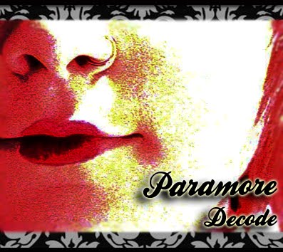
This is a copied image of the lips that feature on my main Cd front cover, i have added them throughout my cd designs so it stays within the theme.


I have added my CD design inside my 6 layers and added it on top of a grey background that has a filter added over the top so it is not flat on the page and looks almost 3D.

This image has been added in between each of my 6 slides, this is because if the digipak was going to be made for real on paper, the red columns are splitters in between the slides.

Making of the Actual CD Design.

Original


Finished Copy.

The first image above is what i have used to do my designing work
on, I have uploaded the image to Photoshop and added the
damask pattern again to the Cd, this is because this pattern is
being shown throughout my supporting products.

In the making.
Use of crosshatch
cutting around using lasso tool and selecting inverse.
Pasting damask pattern into the selected inverse shape.
Added heart autpshapes in colour
Added text inside the image and used drop shadows where needed.
finally played around with the brightness and contrast.

Shot List

Shot one - A tilt
The next shot which shows the other setting- Panning around the scene.
Shot three- the couple walking down the bridge, the camera is a long shot with the couple getting closer- handheld camera.
Shot Four- This shows the back of the couple, walking to the final setting. ending in a long shot.
Shot Five- This shot is of the singer- it is in a medium close-up.
Shot Six- Close up of lip sincing the words.
Shot Seven- A medium close up of the singer on stage.
Shot Eight- The camera is over the shoulder of the two characters. almost like a two shot but in a medium close up of the couple holding hands.
Shot Nine- A medium close up on the singer singer miming the words.
Shot Ten- Close up of lip sincing the words.
Shot Eleven- A medium close up on the singer singer miming the words.
Shot Twelve- A two-shot of the couple happy in a previous life in their relationship.
Shot Thriteen- A long shot of the singer merges into a close up of the lip sinc girl.
Shot Fourteen- Pans around showing the boy getting up and leaving, following his moves.
Shot fifteen- A medium close up on the singer singer miming the words.
Shot Sixteen-Following shot (pan) the boy as he walks away from the girl.
Shot Seventeen- handheld shot of the girls reaction to her boyfriend leaving.
Shot Eighteen-A medium close up on the singer singer miming the words.
Shot Ninteen- two shot of the couple standing in line with one another.
Shot Twenty- two shot close up of handing the note.
Shot Twenty one- over the shoulder shot of girl opening letter.
Shot Twenty two- over the shoulder shot of the girl reading the actual letter.
Shot Twenty Three- medium close up of the girl looking into the camera.
Shot Twenty Four-long shot of the girl spinning around.
Shot Twenty Five- Panning around epically fast, Point ov view shot.
Shot Twenty Six- Various fast clips of all that has happened in the above, A fast sets of clips.
Shot Twenty Seven- Panning around epically fast, Point ov view shot.
Shot Twenty Eight-Close up of lip sincing the words.
Shot Twenty Nine-Close up of lip sincing the words.
Shot Thirty-medium close up of the girl looking into the camera.
Shot Thirty One-medium close up of the girl looking into the camera.
Shot Thrity Two-Over the shoulder shot of the girl looking into the mirror realising reality.
Shot Thirty Three- Close of girl in the mirror
Shot Thrity Four- Over the shoulder shot of the girl in the mirror.
Shot Thirty Five- Medium close up of the girl lip sincing the words as she writes down
Shot Thirty Six- Close up of what the girl is writing.
Shot Thrity Seven-medium close ups of the girl tearing the bit of paper up.
Shot Thirty Eight- Over the shoulder shot of the girl brushing the table of things.
Shot Thrity Nine-Panning around the floor to reveal at the end the note saying, i love you.
Shot Fourty- Panning around the girl the month later walking to first setting.
Shot Fourty One- high angle of girl in her bedroom
Shot Fourty Two-stedishot looking at the girl sit back down on the bench the month later.
Shot Fourty Three- medium close up of the girl looking into the camera.
Shot Fourty Four- A multiple four shot- of the different flashbacks of what has gone on above.
Shot Fourty Five-medium close up of the girl looking into the camera.
Shot Fourty Six-Close up of lip sincing the words.
Shot Fourty Seven-Close up of lip sincing the words.
Shot Fourty Eight- medium close up of the girl looking into the camera.
Shot Fourty Nine- stedicam watching the couple walk away into a long shot.
Shot Fifty- the couple walking back up he bridge, the camera is a long shot with the couple getting further away- handheld camera.

Cd Cover In The Making.

Here are a few images of what interested me in doing my Cd cover
and how it was done.


This was the first image that i had taken to feature as my front cover, i knew from editing previous how to make it into pop art and from paying around with Photoshop i was able to edit this nicely into the way i wanted it.

I added a feature background that would be seen throughtout my work, this was the damask pattern you can see below or by CLICKING HERE.


How i have edited it: By using the 'Add noise' tool in Photoshop,
By changing the 'Brightness and Contrast' dramatically.


I like the effects i have used but i did not want to go over board and ruin the image as i thought there was enough going on on the the page. It's clear, and very eye catching with the red and pattern colours.


And so with playing around with the lighting and contrast i was able to finish my product. I added a black border around the edge and blurred around the main image just before it met the damask pattern, this is so there is another effect added and it shows more shape to the cover rather than flat on the page.

Editing of Images for front cover 2

Before image


After Image


In the making above, is me using Photoshop, as you can see there is a pattern , i was experimenting with having a patterned background. By lassoing the main image and adding the pattern background it did not look right but i gave it a go.

In the making:
I played around mostly with the colour balance,
brightness and contrast
experimented by adding text (taken out)
experimented by added autoshapes (taken out)
Added a sepia colour as well as adding black and white.

I really like this second image as i do think it looks professional, i just didnt think it would suit my Cd Digipak.

Editing of Images for front cover

Here i have had a go at an image that i was going to use for my CD front cover.
This image was not used but it shows that i have had a go at editing.